
I finally done with the journal page for the summer of color, week two. This weeks chosen colors were Hot Pink and Orange. I think it’s a gorgeous color combination. I loved dressing up my baby girl in these colors, when she was youger. She’s now 16 and won’t take any advice from me. Which, of course, is how it should be =).
I love painting with these colors, but somehow this page has been giving me a headache and it took a while for me to wrap my head around what it was that was bugging me and finish the page.

Instead of telling you a realy long story, maybe I should let the progress pictures tell the story for me.
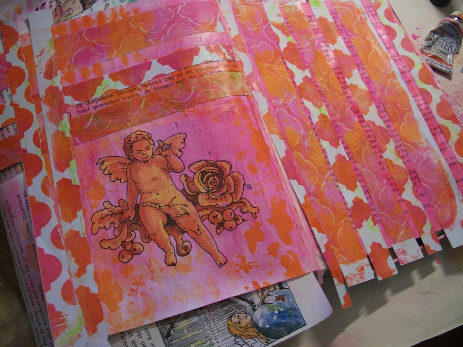
I started out with some light spraying and stenciling in pink and orange on a page in the book. There was already an orange cherub on the page.

I added some gelliprint strips and was actualy realy pleased with it.
I didn’t know how to take this nice clean page any further, so I decided to write on it…

In big black letters and I so did not like this. You’d think I would know by now that I don’t like my writing…

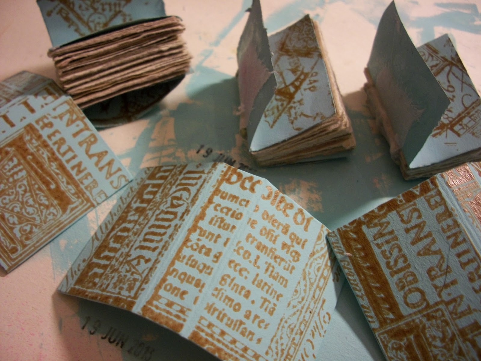
To balance it out I added some rub-ons. That made it a little better, but not much. So I walked away from it and made the covers for some tiny books to get my mind off it.
Came back and muted it all down with white paint, but the letters kept shining through. Pink this time =).

Walked away from it again and finished the booklets. Here’s a sneek preview of the booklets.
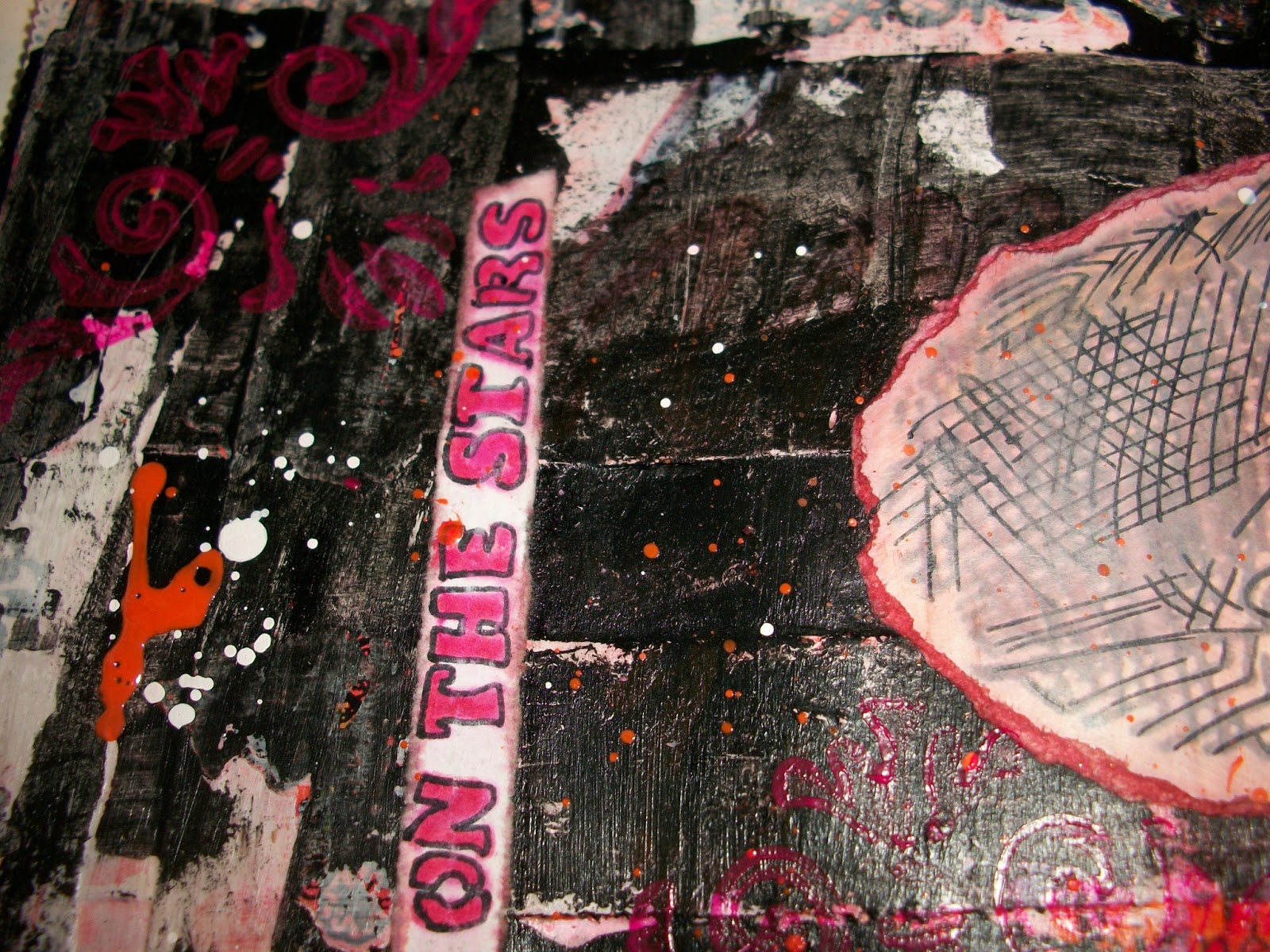
When I came back to the journal I went for my favorite color, black and that made me happy.
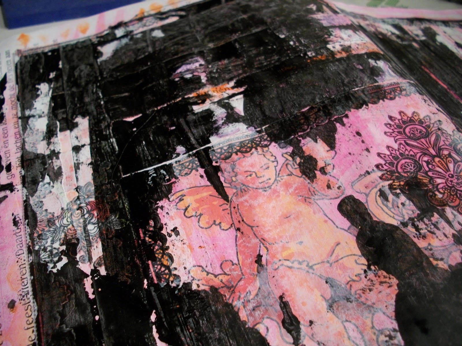
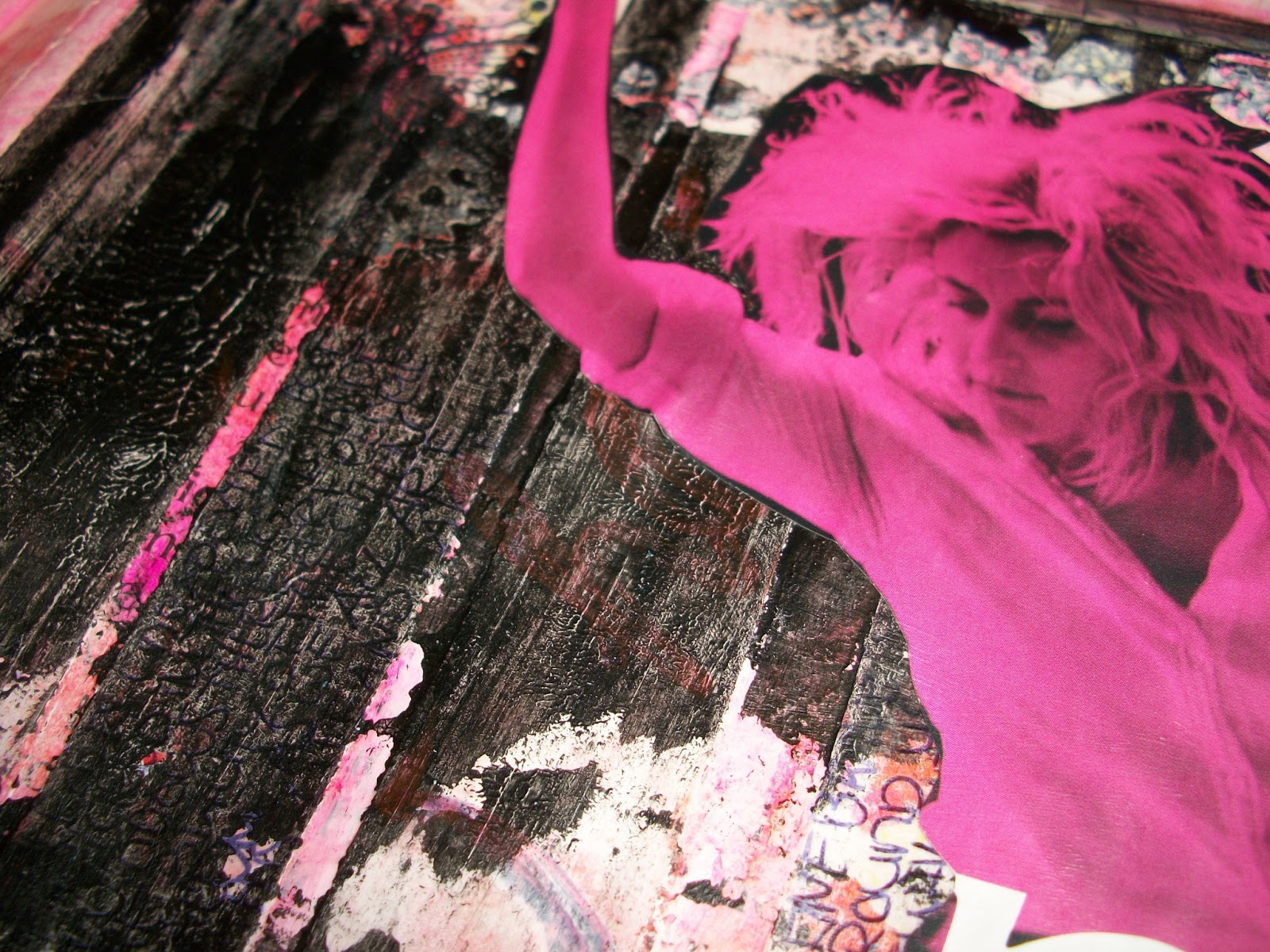
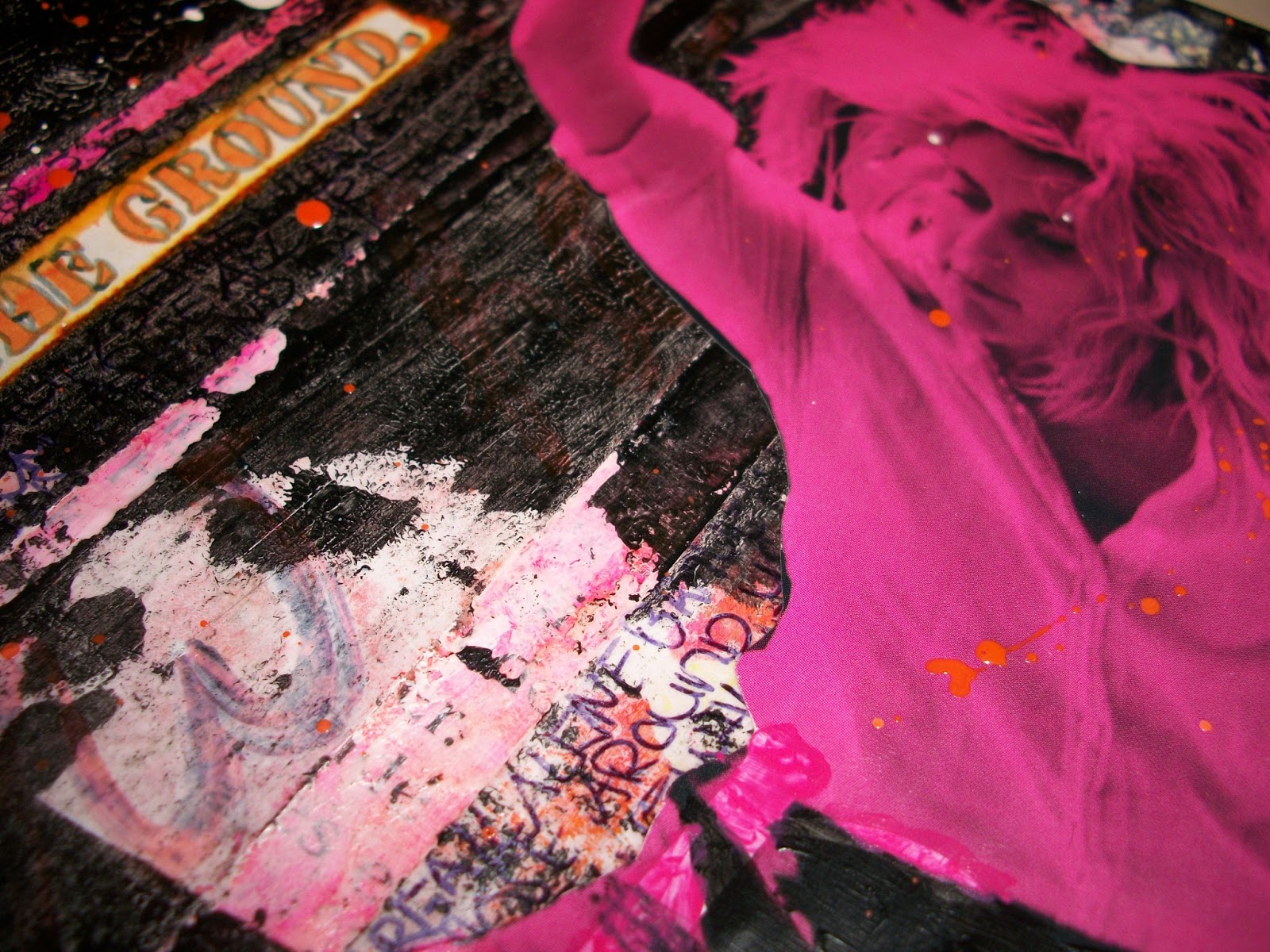
Found the perfect picture to add to the page.

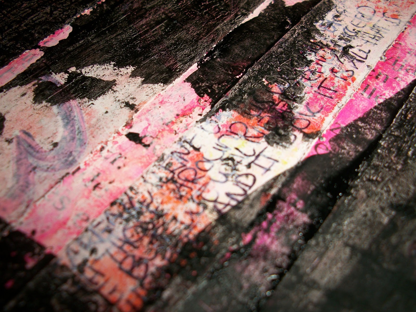
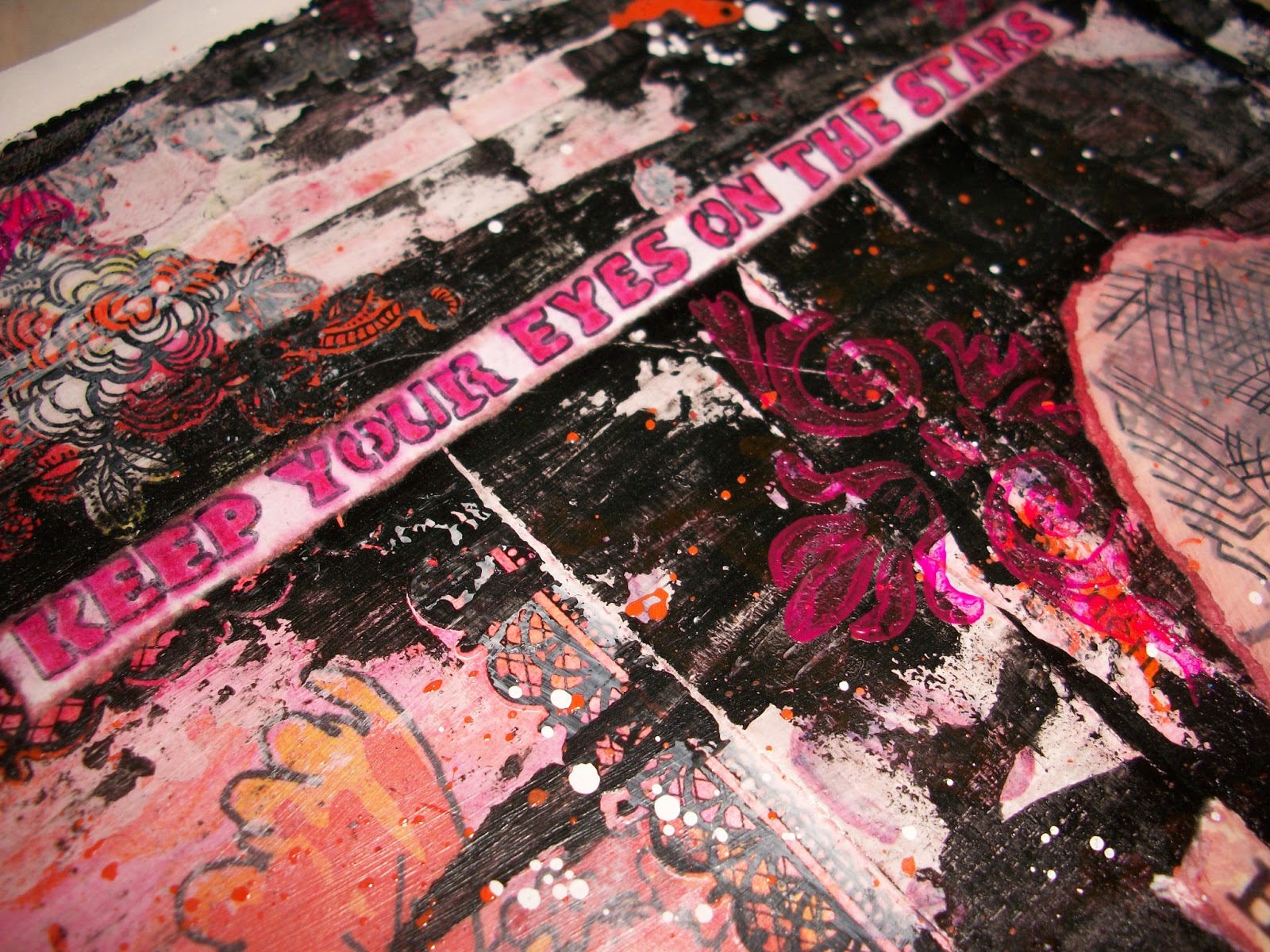
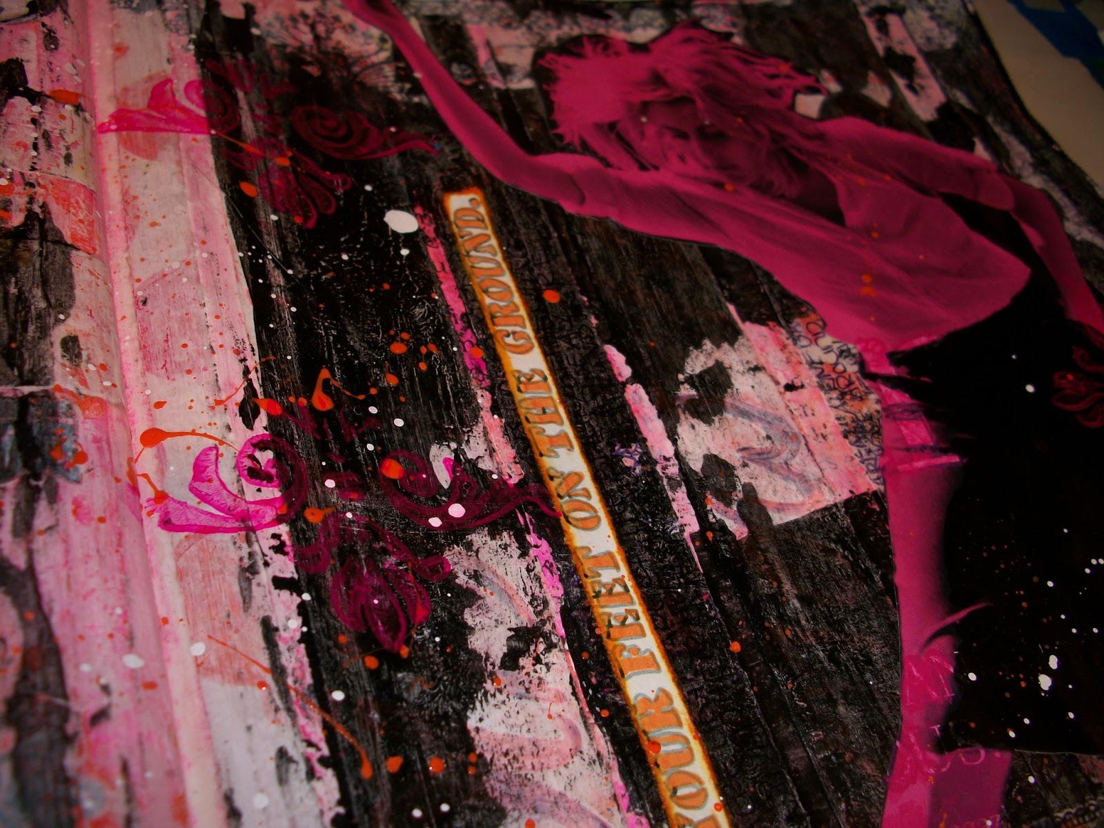
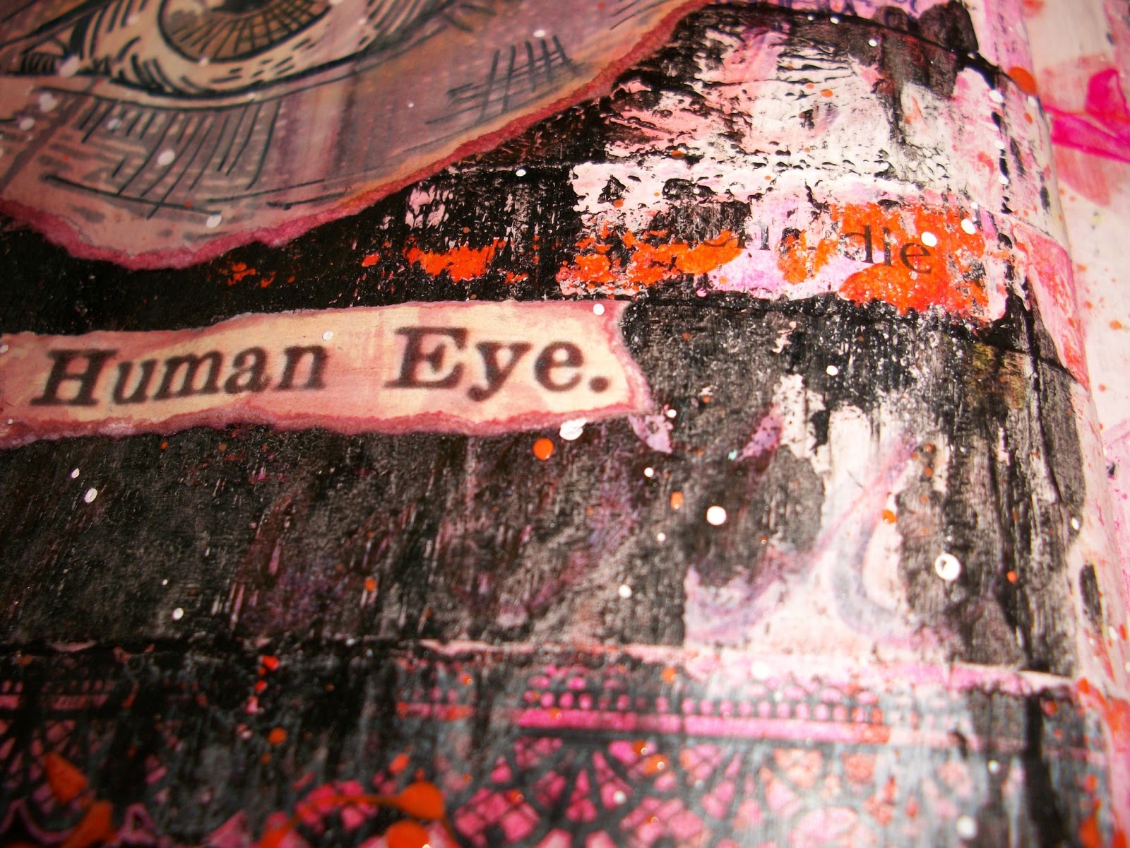
Added an eye, a tag, some stamping, splatters of paint and ink and found the perfect quote to bring it all together.

Did some touch-ups and I now feel the page has come together and has a story to tell me.

Something to keep in mind.
Dance, fly, create, dream


but stay grounded.


As per usual there are way to many pictures, but I don’t know how else to show all the details and layers in this.
I’m happy with how it turned out and I think I was subconciously trying to tell me something with this. I will keep my eyes on the stars and I will keep my feet on the ground. and stay true to myself. It’s funny how this somehow happens with the creative process of making an art journal page. Does this happen to you also? Does your subconcious tell you things while creating?
And since you made it this far, I also wanted to tell you that the drawing for my birthday giveaway is still open till tuesday 25th of june, You can find it here.
Edited this post, because I just found out that my art journal book cover made top three at Simon Says Stamp and Show: The Button Challenge. I’m so delighted with that. There were so many talented and gorgeous entries. Here is the post where you can find the wonderful entries from the top three winners and the winner of this challenge.
Thank you so much for watching and I wish you a wonderful weekend.
Linking this to:

I just love how grungy and textured it is, and how the black offsets the brightness of the pink and orange. Thanks for showing us all the layers!
LikeLike
I too like the grunginess of the final page, it goes so well with the meaning of the text. We have to listen to our inner voice, I kn ow ir I dont I will not be happy with the result even if others are!
LikeLike
Turned out great! Love all the texture. I think your handwriting is great. I don't know why you say it is bad. Great job!
LikeLike
This is a gloriously distressed and deep page full of layers and story. It makes me shiver and smile all over. 🙂
LikeLike
I love this so much!!! The colours so full of life and emotion! Yes, it amazes me how a journal page can reveal all kinds of suppressed thoughts and how you always seem to learn from it. I recently did one for a dictionary challenge on the letter u. I did urban and discovered what I felt about living in a town – weird and enlightening. Others journals can teach us too – yours has inspired me! Lovely work Julie Ann xxx
LikeLike
Love all the visual texture and there is a lot of symbolism there – I like what you said about reaching for the stars and keeping your feet on the ground. Congrats on your journal cover! HPPF
LikeLike
Very dynamic pages!
I really love the gelliprint strips, too.
And all the detailed photos are fantastic!!
♥♥♥
Happy PPF!!
Mary
Mixed-Media Map Art
LikeLike
Waauw, I love your journal pages,and all details on it,great colors.
Greetings Jeannette
LikeLike
Wow dit ziet er schitterend uit allemaal, mooie kleurencombinaties!
Gezellig weekend!
Groetjes karin
LikeLike
I love these photos and the pages!! A wonderful message with gorgeous details and color!! I think my message comes after I revisit a piece down the road…not always evident at first sight!!
Wonderful post…
Hugs Giggles
LikeLike
Wonderful pages! Valerie
LikeLike
The details are stunning and i am fascinated by those little booklets… they look amazing…xx
LikeLike
What a FABULOUS journal spread. Looks fun, edgy, colorful, sophisticated and so much more. Yummy!
LikeLike
Gefeliciteerd met het behalen van de top 3 🙂 Prachtige pagina, al vind ik jouw handschrift *wel* mooi.
LikeLike
Never apologise for there being too many photos! One of the things I like best about your blog is the detailed photos you take, your process and finished work have so much to see, Great entry for the challenge.
LikeLike
It was so great to watch the progression of your page–but I have to tell you, there is nothing wrong with your lettering, I thought it looked great! Love your finished page–really cool!
LikeLike
Wat een krachtige pagina's Monique…wauw, dat is het bekijken meer dan waard! Heel mooi…
goed weekend, Alie 🙂
LikeLike
WOW! I absolutely LOVE how your final pages turned out! Thank you for showing us the process, too! The textures and colors look amazing, creative and very beautiful!
LikeLike
Thank you all for your lovely comments.
xx
LikeLike
Wow, fabulous pages, I really love the grungy background and texture, and those colours work so well with the black.
LikeLike
A fantastic page Monique! I love to see your process! Gorgeous colours too, they are also favourites of mine!
Alison x
LikeLike
Oh havens, I LOVE the transformation!!!. Gorgeous, spirited and just steal my heart!! I think, black-orange-pink is the sweetest color combo ever :). AND, I'm in LOVE with your teeny books, they are the cutest!
LikeLike
Great pages! Nice Work!
LikeLike
Amazing watching your page build up… thank you for sharing your process with us!
Alison x
LikeLike
Oh my- I just LOVE the whole vibrant grunge look of your finished spread-really FAB!!! And those little books are marvelous too 🙂
LikeLike
Super gave pagina's Monique
Zoveel op te zien .
Echt Prachtigggggggggggggggg.
Groetjes Janny
LikeLike
Hot pink and orange is one of my favorite color combos!
LikeLike
I loved seeing the progress of this page. So different from what you started with 🙂
And yes, I find that my pages end up telling me things, sometimes over the course of a week three or four pages end up saying the same thing in different ways. Finally I get the message!
LikeLike
Wow Monique, it is very interesting how your page has turned out in the end! It's gorgoeus!
LikeLike
It turned out great, Monique, though I did love it a lot just before the black. That orange cherub with all the hot pink around is really gorgeous.
LikeLike
OH, I LOVE seeing all of your progress shots! It's really generous of you to share too. Your page is gorgeous, so full of texture, color and life! xoxo
LikeLike
Wow – what a great page! And I really loved seeing all the pictures showing how it developed. Great work!
LikeLike
Great journal pages! and thank you for sharing the photos showing the process!
Hope you had a wonderful birthday! 🙂
Ilona
LikeLike
WOW this page rocks! How I love this motion in it 🙂 ♥ Conny
http://piaromsartjournaling.blogspot.de
LikeLike