
I’m participating in the Summer of Color. Where this year the colors to be used on your projects are chosen by the participating artists. This week, week one, the colors are Citron Green and Turqoise. Two of my favorite colors.
Here’s my entry for this week:

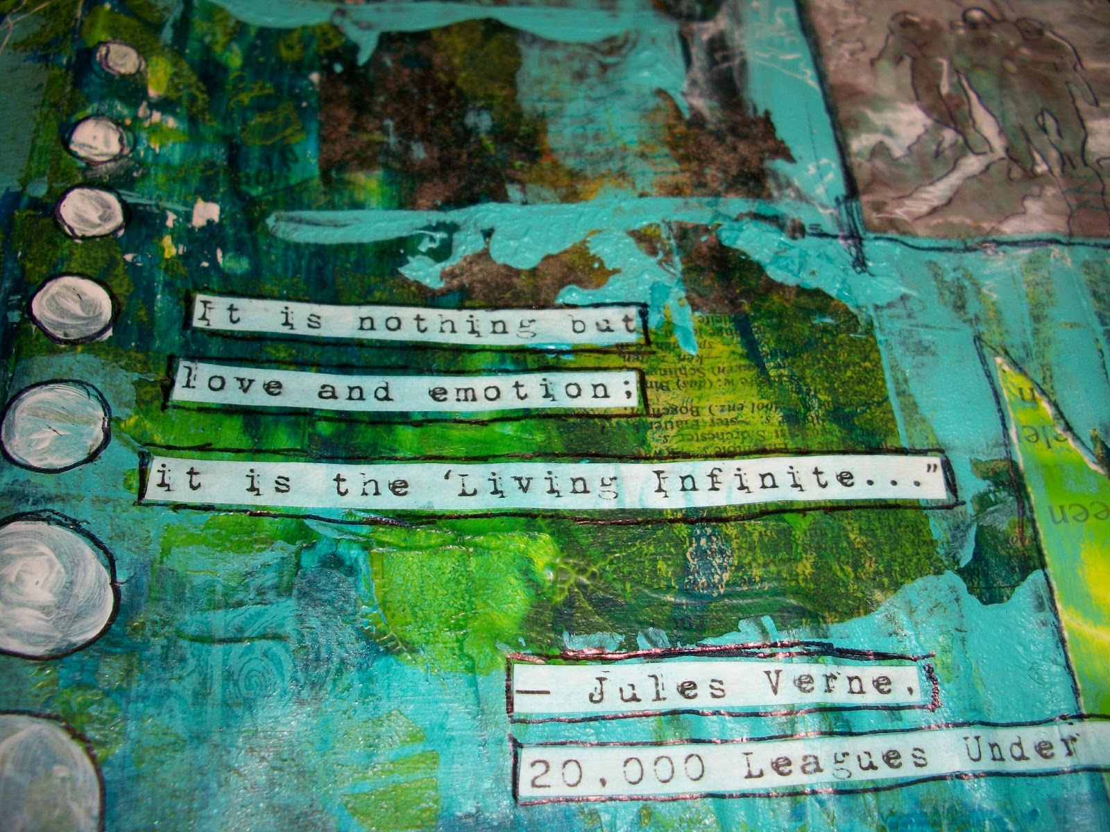
“The sea is only the embodiment of a
supernatural and wonderful existence.
It is nothing but love and emotion;
it is the ‘Living Infinite…”
― Jules Verne, 20,000 Leagues Under the Sea
I remembered to make some progress pics and of course some detail shots, so this is a rather picture heavy post =).
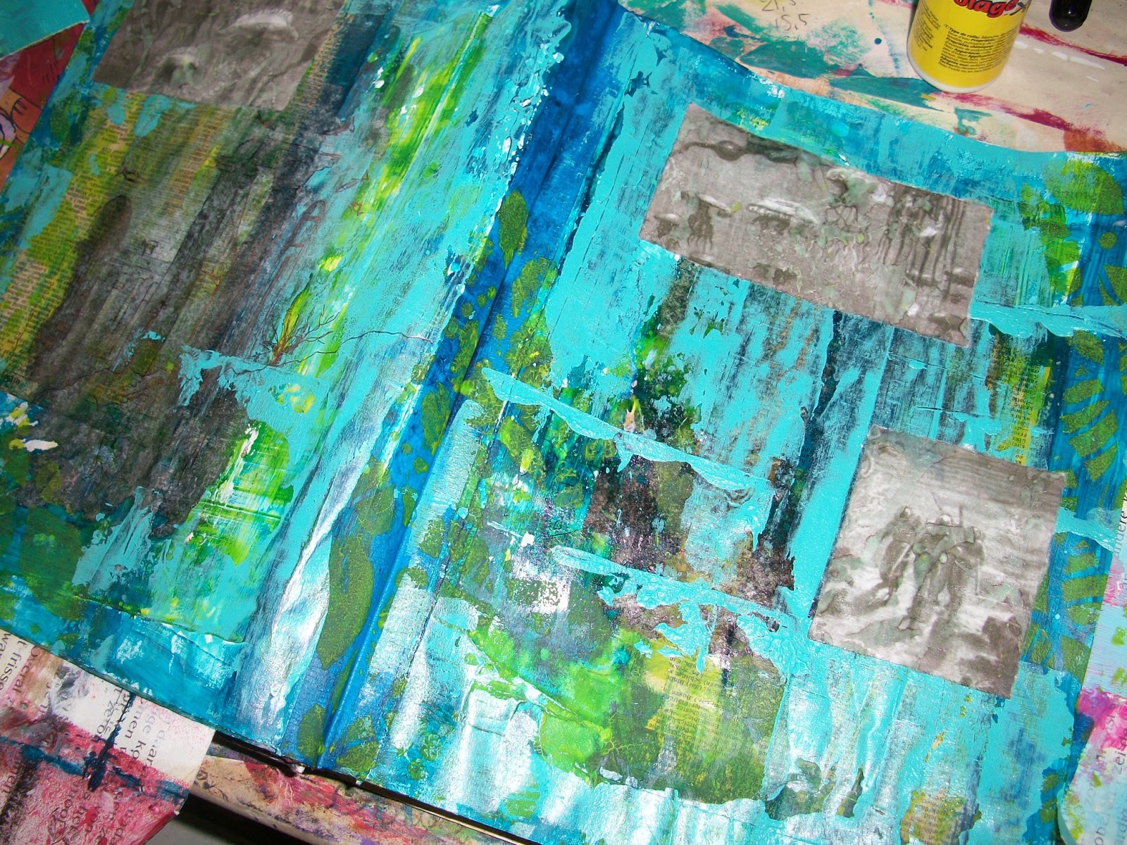
I started with a gessod page in my altered fairy tale book. Put a piece of blue masking tape down the middle and glued two dictionary pages down.
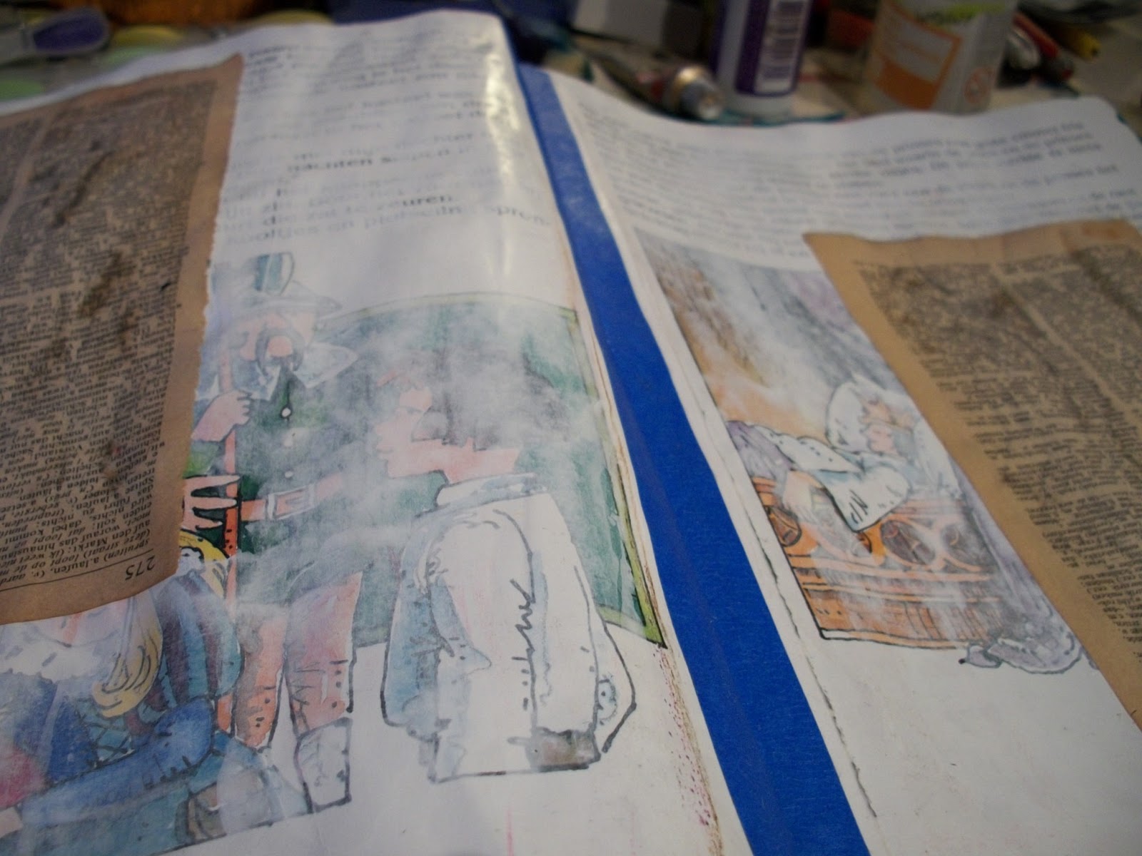
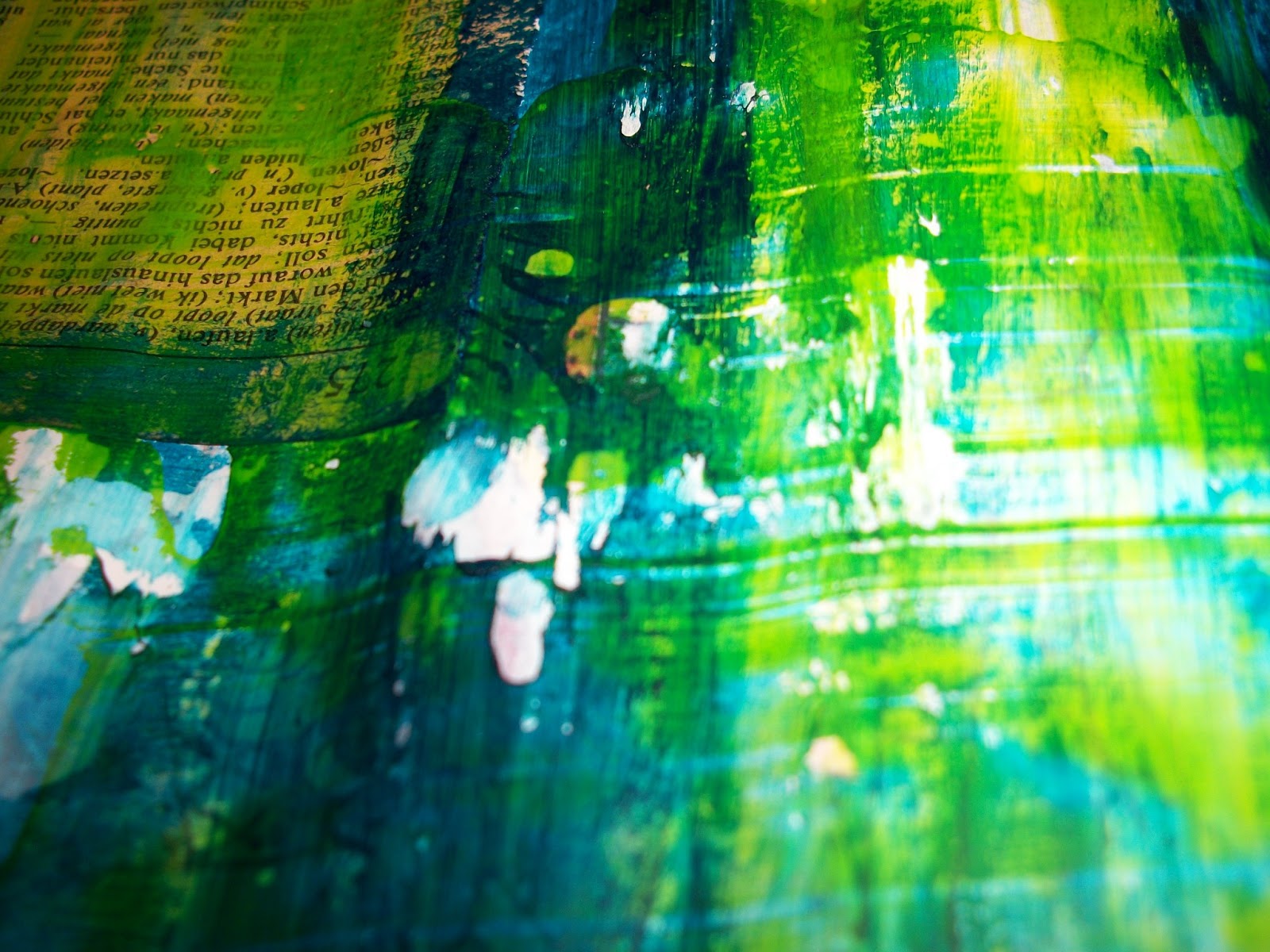
Slapped some Citron Green on the page with a credit card and then I cheated a little, because I added some dark green blue color for depth later on. I dripped water over the still wet dark blue and blotted it of with a kitchen towel to create those splattered bubbles.
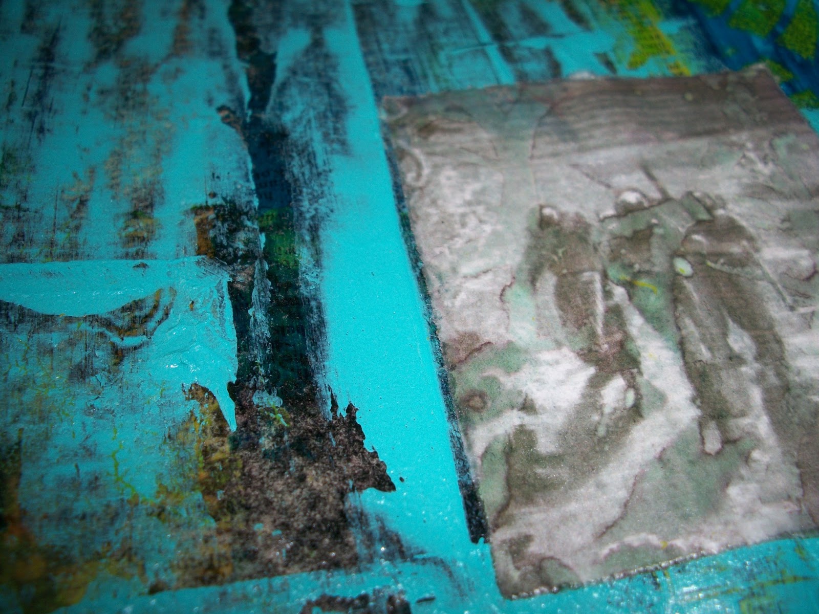
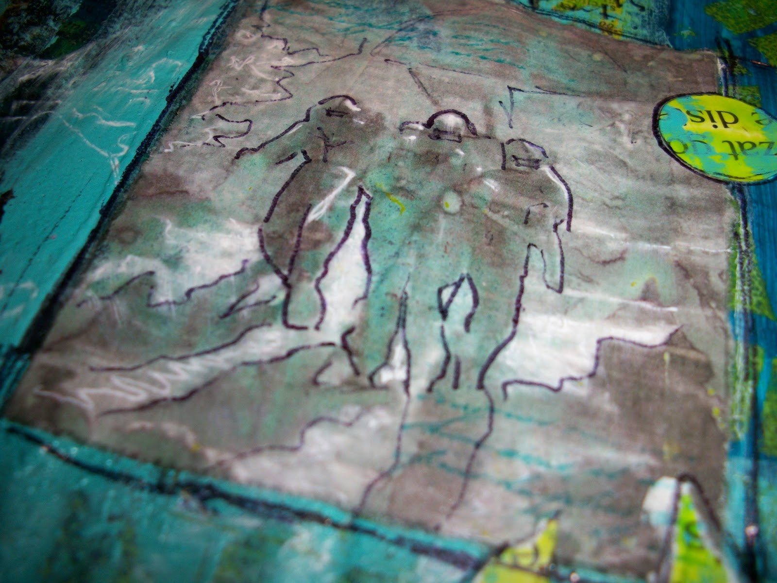
Tried my hand (again) at transferring 2 pictures (Jules Verne, 2000 leagues under the sea) with gel medium. I must be doing something wrong, because I never get a clear picture. I guess I’ll just have to practice more. The first picture I feel is usable, the other one not so much.
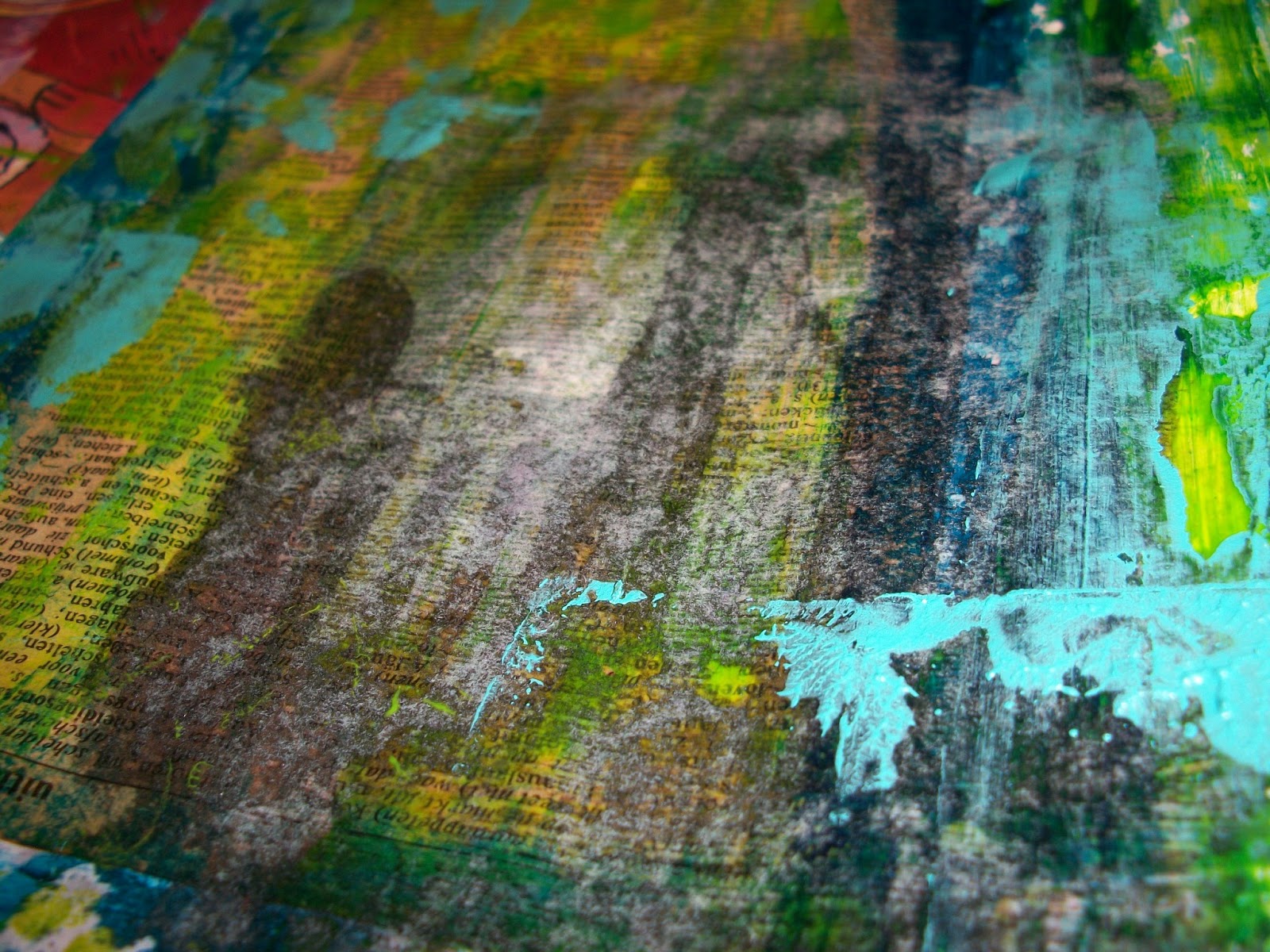
Added Turqoise to the page followed by Citron Green this time through a stencil. The remaining paint I put on one of the pages of the book that had been torn out, while prepping the book for use as an art journal.
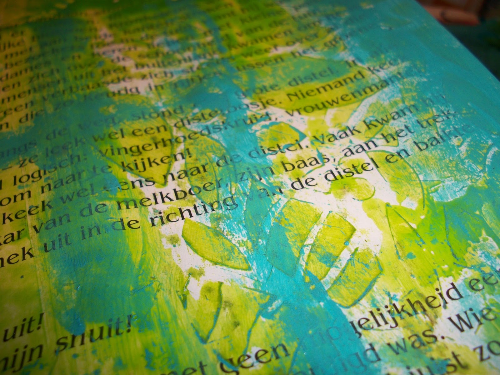
I then printed another picture from that same Jules Verne story and put the same stencil I used for the Citron Green on the print after I wet it thoroughly. This causes the print to change color on the places it gets wet.
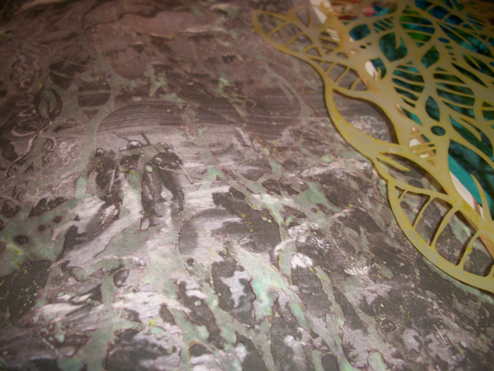
I cut out some parts from the picture and glued it to my scene. On the right side you can still see the failed transfer peeking trough under the Turqoise.
I doodled and sketched an outline to all the pictures with a black pen and later added some white detailing with gel pen.

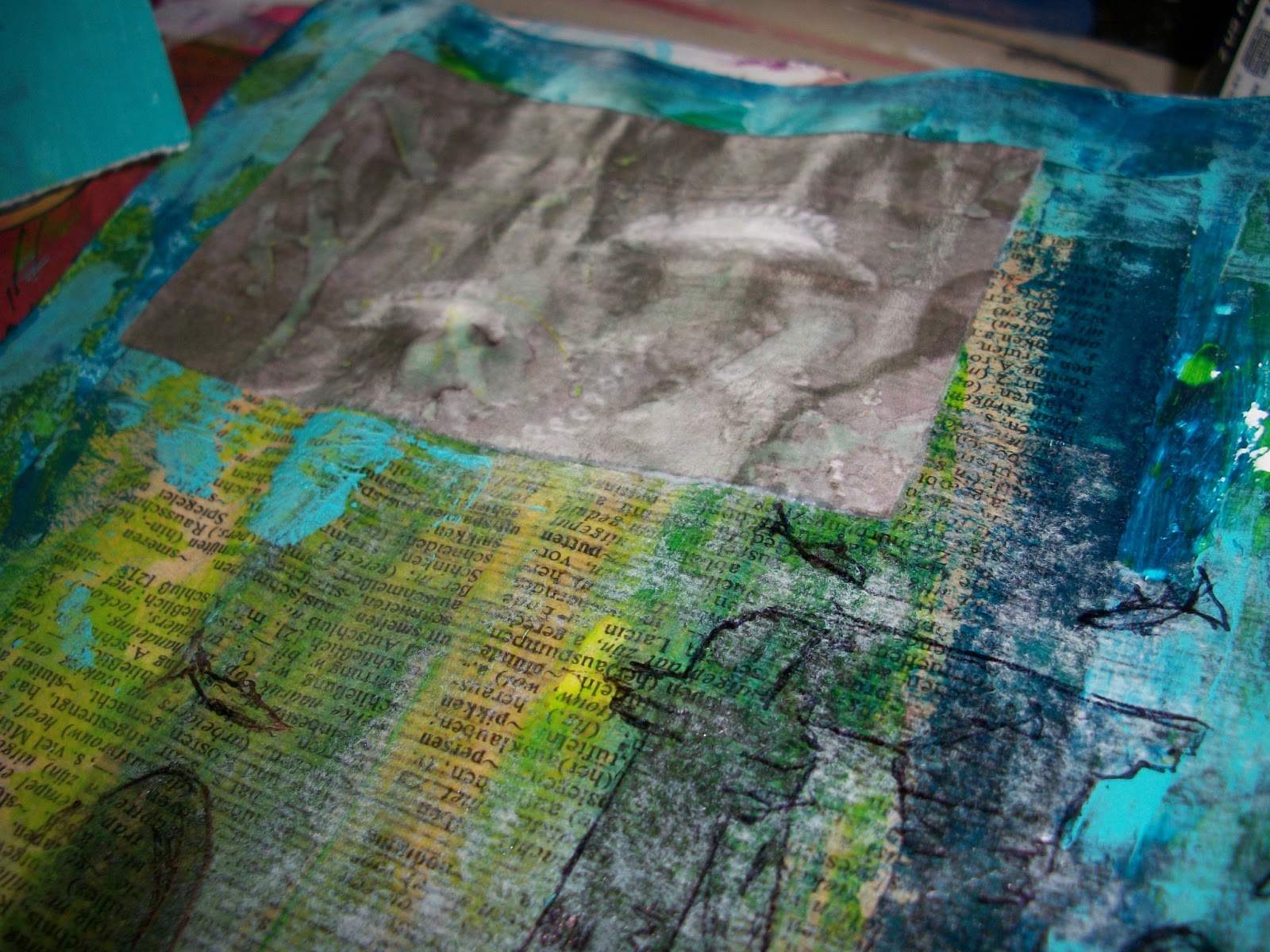
Added some “sea weed” strips made from the page with the excess paint. Painted some white bubbles and added a quote from the story.
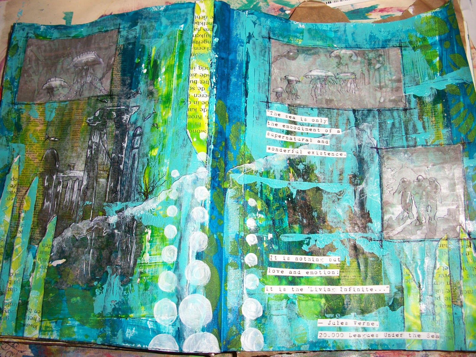
Played with some embroidery floss, punched out circles, doodling/out-lining and added some journalling to finish the page.
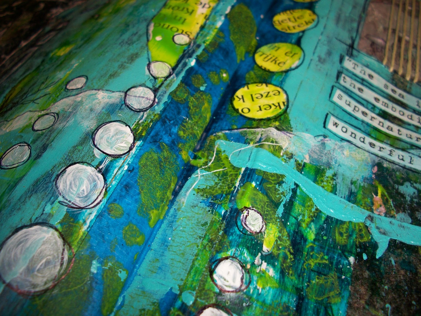


I also stamped a teensy weensy bit on th page with Aquamarine archival ink and wiped the white of the printed quote with that same ink.

So there it is, my entry for the Summer of Color, week one.
I would also like to enter this in the June Challenge – Underwater over at SanDee and Amelie’s Steampunk Challenges, as I feel this has still a steampunk underwater theme, even though there are no gears in sight. To me Jules Verne is the founding father of steampunk, so I hope it’s alright.


Wonderful Journal Pages,Beautiful colors,Love it!!!
Greetings Jeannette
LikeLike
Beautiful work, love those pops of acid colours, great! Valerie
LikeLike
A wonderful, mystical underwater world! The color matches perfectly!
LikeLike
This is awesome!! Love the colors…the placement of the circles and strips really make a statement 🙂
Thanks for the sub and I will be back…great blog
LikeLike
Of course there is more than enough Jules Verne feel to your awesome page, Monique!
Steampunk at its best! Who says that it always has to have some gears to make it Steampunk? 😉
I LOVE your page – especially the sunken city and the colours combined with the words! Awesome!
Thank you for joining us again at SanDee&amelie's Steampunk Challenges!
Hugs,
Claudia xx
LikeLike
Wow, what an interesting couple of pages. Loving how you did transfers. Well done. 🙂
LikeLike
Lovely pages – it's fascinating seeing how a piece of work develops in stages – I always forget to photograph mine until it's done! Great use of the this weeks colours.
LikeLike
Mooie textuur en kleuren 🙂
LikeLike
wow your journal spread is awesome, so many wonderful layers. Happy SOC, Annette x
http://nettysartadventures.blogspot.co.uk/
LikeLike
Wow! love seeing your process. I never remember to do that…LOL.
LikeLike
Amazing to see your progress Monique and the page is fabulous! I love all on it!
LikeLike
Super paginä's Monique en wat een aparte en gave achtergrond.
Groetjes Janny
LikeLike
WOW! This is fabulous! I bought an art journal a few months back, but it is still blank! Maybe you can inspire me with your gorgeous pages 🙂 keeley
LikeLike
Thank you all so much for your lovely comments.
LikeLike
Such interesting pages…wowww…your creativity is so special!
kind regards, Alie 🙂
LikeLike
Monique, this page is stunnig! I really love it! Thanks for showing us how you did it!
LikeLike
WOW, how YUMMY this page is, love seeing the process! I can see how much fun you had creating this, these colors are beautiful together. So fun to see what others are doing for SOC. Enjoy the next week too!
LikeLike
Fab! I love all the detail photos – helps you to see all the yummy textures.
LikeLike
I loved being able to see all those details so i could appreciate the textures and work… a wonderful spread… happy SOC …xx
LikeLike
Awesome pages!! I love all of the color and texture you have here!! They are so beautiful and creative!
LikeLike
This is a joy to watch come together! Thank you for the pictures and for sharing your process with us. Love your bold, beautiful page with all the dots and details. Love the transfers too, xoxo
LikeLike
WOW, these are wonderful journal pages!. The color combos or bright & dark, layered such a way with bubbles & sea weed paper strips make them look magical. I want to visit this underwater world 🙂
LikeLike
Fantastic pages, Monique… amazing layers of depth and texture. And I love that even with those bright colours as your starting point, there's still lots of room for shade as well as brightness. Brilliant! Thank you for all those close-ups of the amazing detailing.
Alison x
LikeLike
Wow…great work and that quote…loved your entry…x
LikeLike
These colours work so well on this journal page. Gel medium transfer is hard to get perfect, isn't it? I tried it for the first time the other day in a new journal. My image was way too big to do, but I was happy with it in the end because I wanted it to look like a peeling poster. I'm going to keep experimenting with this technique. Thank you for sharing these inspiring pages – loved the text on your page. Julie Ann xx
LikeLike
Fantastic Pages! Happy Creating! Tee
LikeLike
Oh my goodness I feel like I've found a kindred spirit! I LOVE your art journal spread, and thanks for showing us the process! That quote about the sea is a treasure! I will be back to visit you again! Thanks for visiting my blog!
LikeLike
Love all the gorgeous depth and color, and thanks for sharing all the steps!
I find with gel transfers that if I want a really clear image I have to use a laser printed image, not inkjet. I often like the softer, more indistinct inkjet ones better though.
LikeLike
I love seeing process shots of people's pages. So many lovely layers make up this glorious page. I love it. I look forward to seeing what you do next week!! 🙂
LikeLike
So many things can be found in your pages. All those layers make it way more expressive! Really like how that came out! 🙂 Have a wonderful weekend!
LikeLike
What a fun journal spread!
LikeLike
Gorgeous pages, i love the layers and colours very reminiscent of the ocean and all it's treasures
Toni x
LikeLike
This is really, really beautiful work! Thank you so much for commenting in my blog, and I'm very glad I found yours that way, too. I'll definitely sign up to follow your blog because I adore your art journaling style. Let's see what colours we get next at the Summer of Color 2013
LikeLike
These pages really came to life as your description unfolded. What a dramatic representation of 20,000 leagues under the sea. I love your choice of colours here. Hugs, Jenny x
LikeLike
Thank you all for your sweet comments. They are very encouraging and mean a lot to me.
LikeLike
lovely underworld pages! loved watching the process!
LikeLike
Dear Monique, I am currently trying to do some Art Journal by myself and find your step by step tutorial very helpful. This is really an amazing work!
And thank you for joining the SanDee&amelie´s STEAMPUNK CHALLENGE
xoxo SanDee1899
LikeLike
beautiful colors.
i like all your journals so much….they are so cretive and colorful !!!
LikeLike
Wow! Love love love all the layers and colors here!!
LikeLike